Logo Design
Logo Design for SDS (case study)

Problem :
Finding and creating the right assets for the case study would prove to be a little challenging, but my skills in illustrator, and XD helped me to create the original formats for the old and new logo to present in this case study.
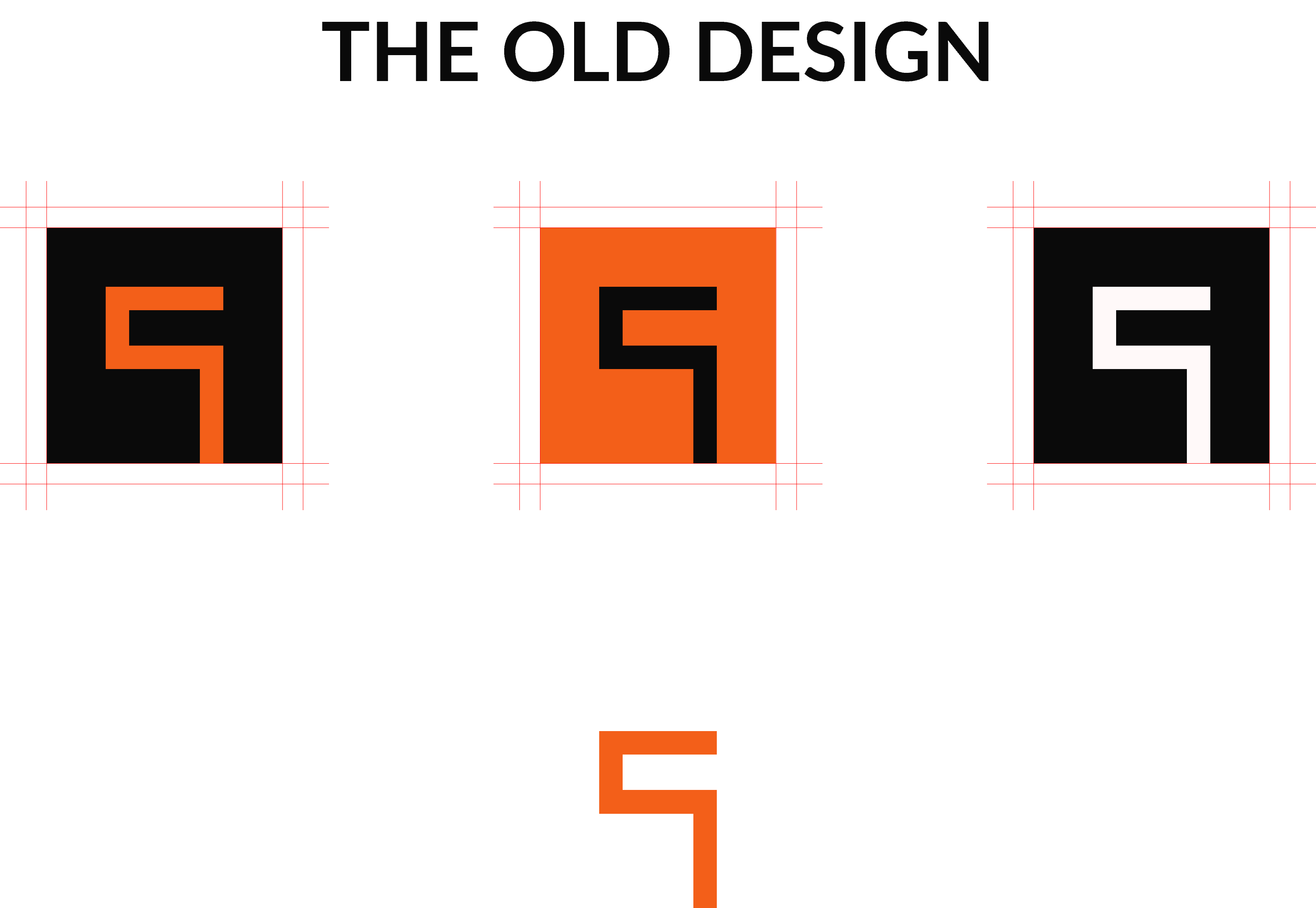
SDS Is a rising design agency founded by Jagadeesh Varma. They provide design services for clients big and small, from their base in Stockholm Sweden, across Europe and beyond. As a result of their growth a generic logo was just not the right fit, and as they wanted to align the logo with the creativity of the agency, a new design was in the cards.
Solution :
My solution was to image trace the assets in illustrator then export them for my case study so I could present them with the best quality.

Challenge :
Presenting the logo new Vs old in a way that stayed true to SDS brand and concept without compromising on quality.

Summary :
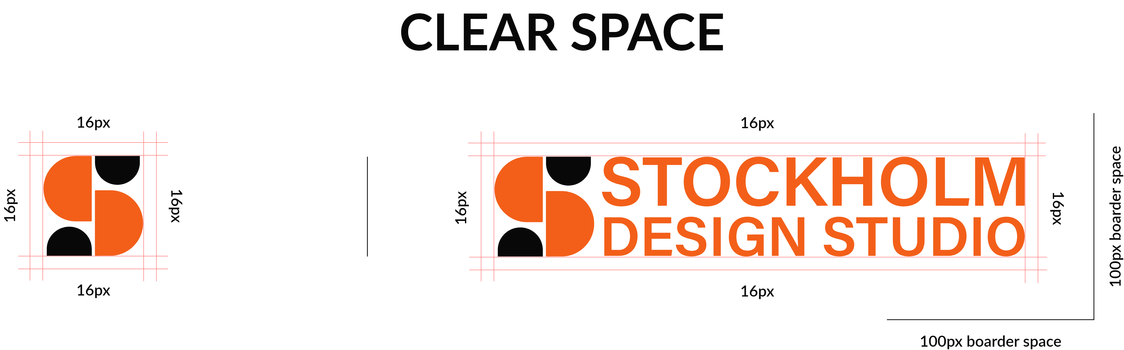
The colors are indicative to the brand, and impression they give. Bright, simple, and clear, no gradients or fancy tones. The word mark is made up of shapes, following the typography of "Acumin variable concept" a google font. It uses shapes instead of type to give a structured balance to fit the pathway of the logo itself. For the logo it was important to have curves following straight lines to give a harmonious feel. Both logo and word mark are the visual face and identity of Stockholm Design Studio.


